Refreshed, Not Rebuilt
The research behind Revive's finalized brand system – From exploratory research to a governed, production-ready brand book. www.Revive.Health
One brand. Two jobs. – Earn the buyer’s confidence & delight the member. Because the benefit employees want to use drives utilization which delivers ROI.
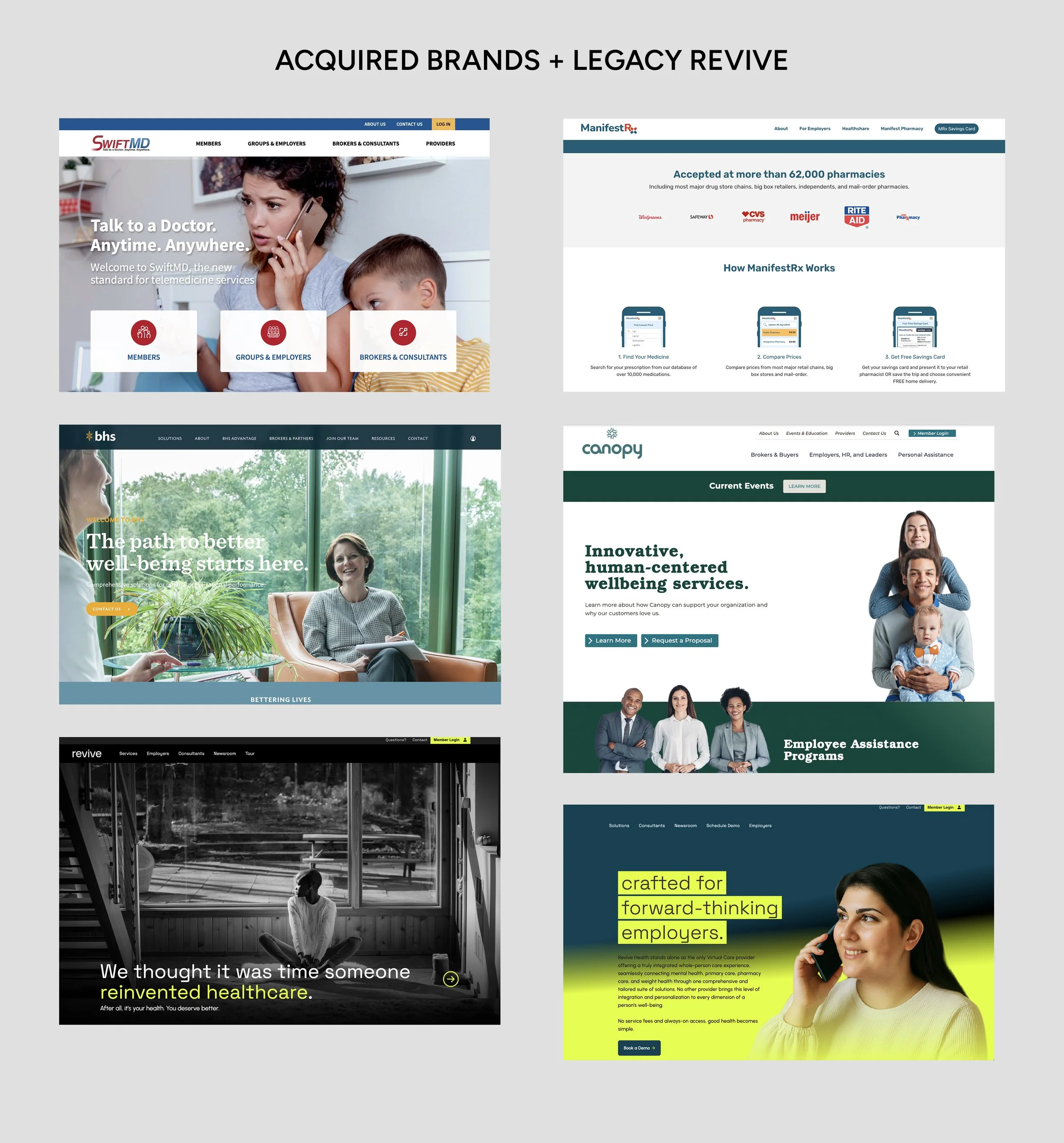
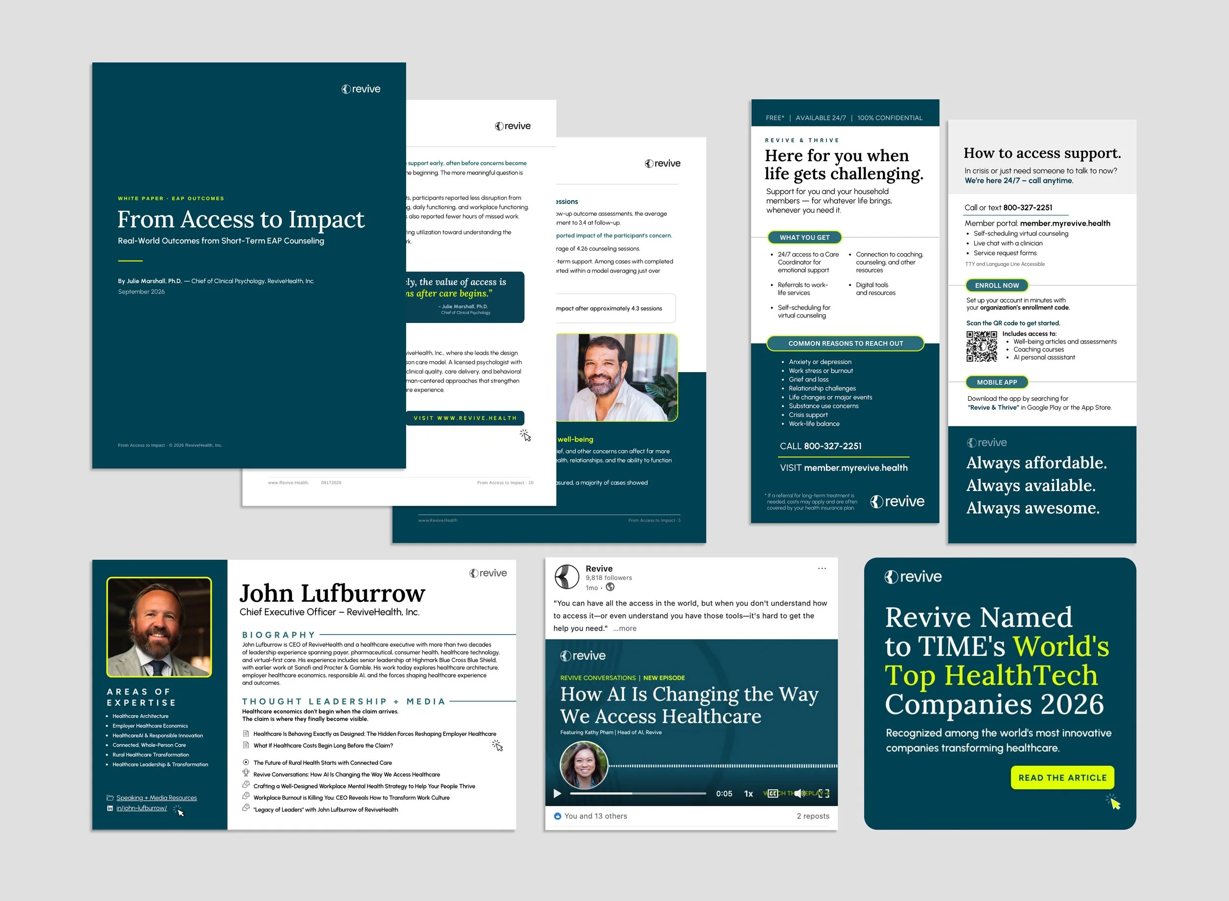
Several brands converging into one unified user experience.
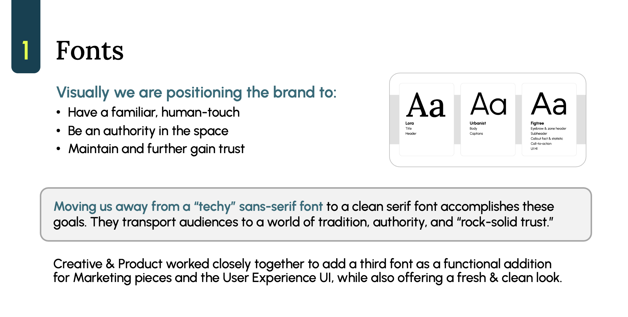
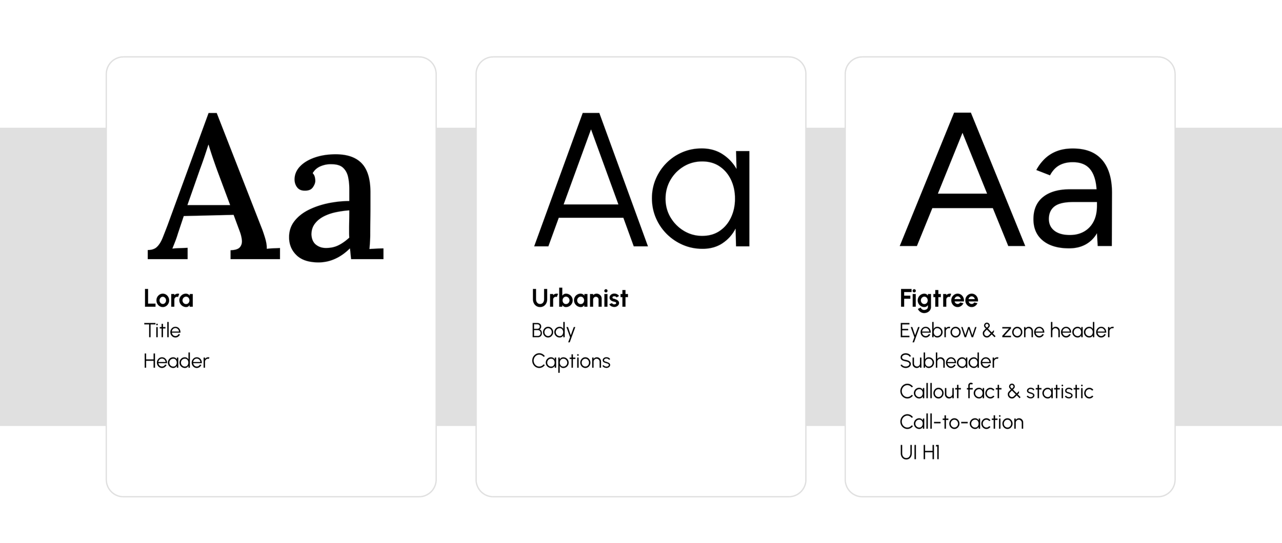
LORA – The Title Font: Serif fonts carry connotations of institutional trust built over centuries. Lora was chosen to transport audiences to a world of tradition, authority, and “rock-solid trust” at exactly the headline moments where first impressions are made.
URBANIST - The Body Font: Urbanist's high x-height, open apertures, and near-zero stroke contrast are functional properties rooted in screen legibility science, not fashion — which is exactly why it survived the entire process unchanged.
FIGTREE — The Supporting Font: The third typeface carries more visual weight than either Lora or Urbanist individually. Lora gives empathy and warmth; Urbanist provides focus and calm; Figtree drives action — CTAs, eyebrows, tags, subheaders, and anchoring the UI at the H1 level.

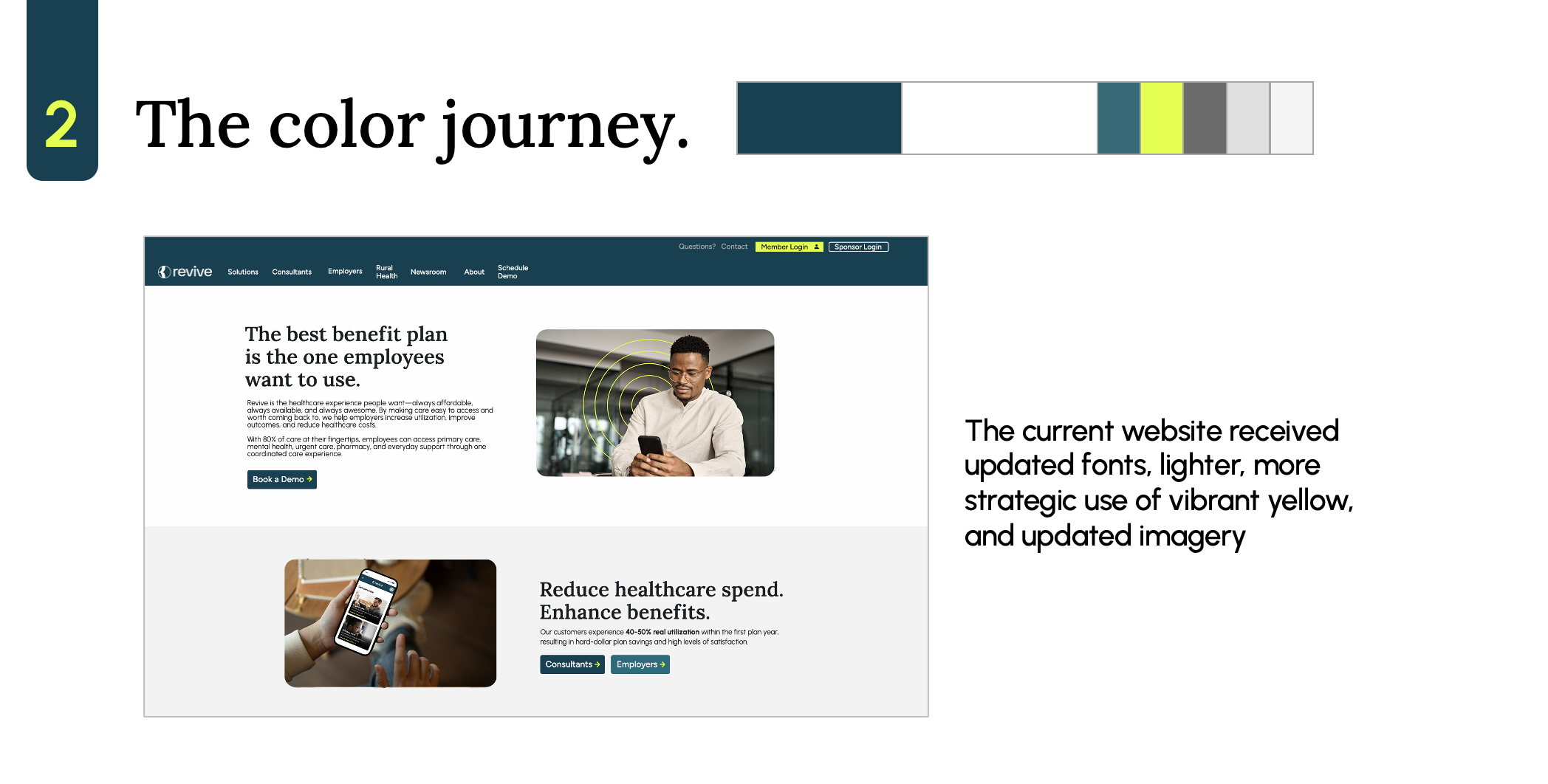
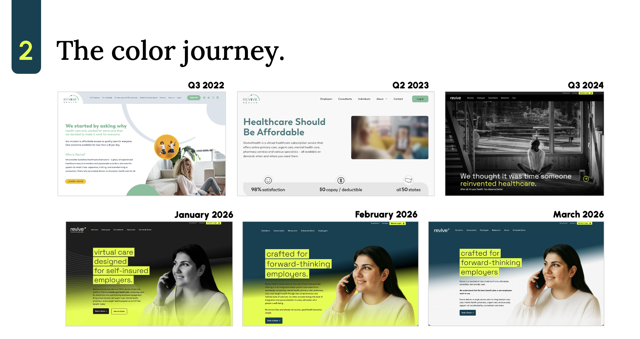
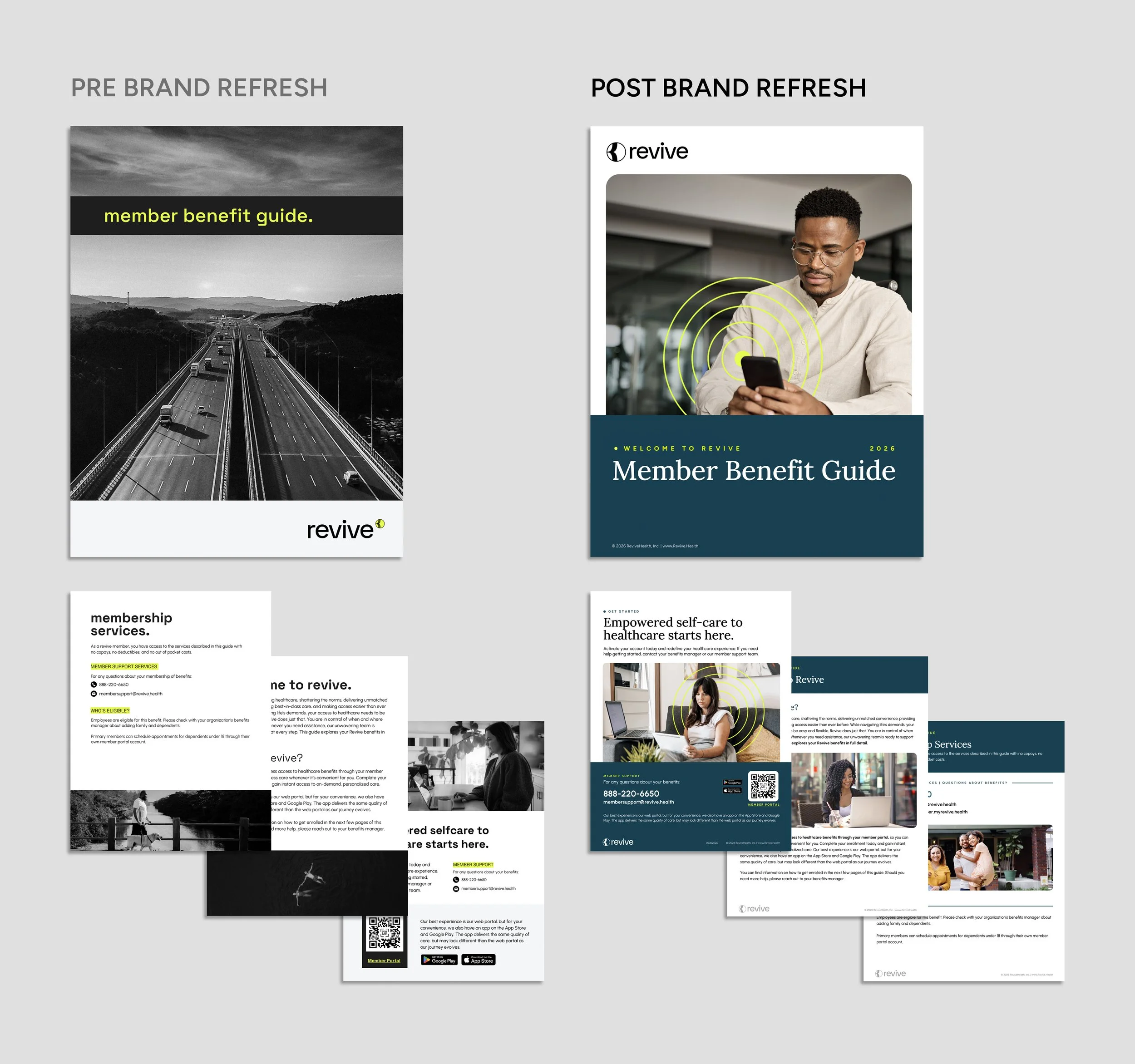
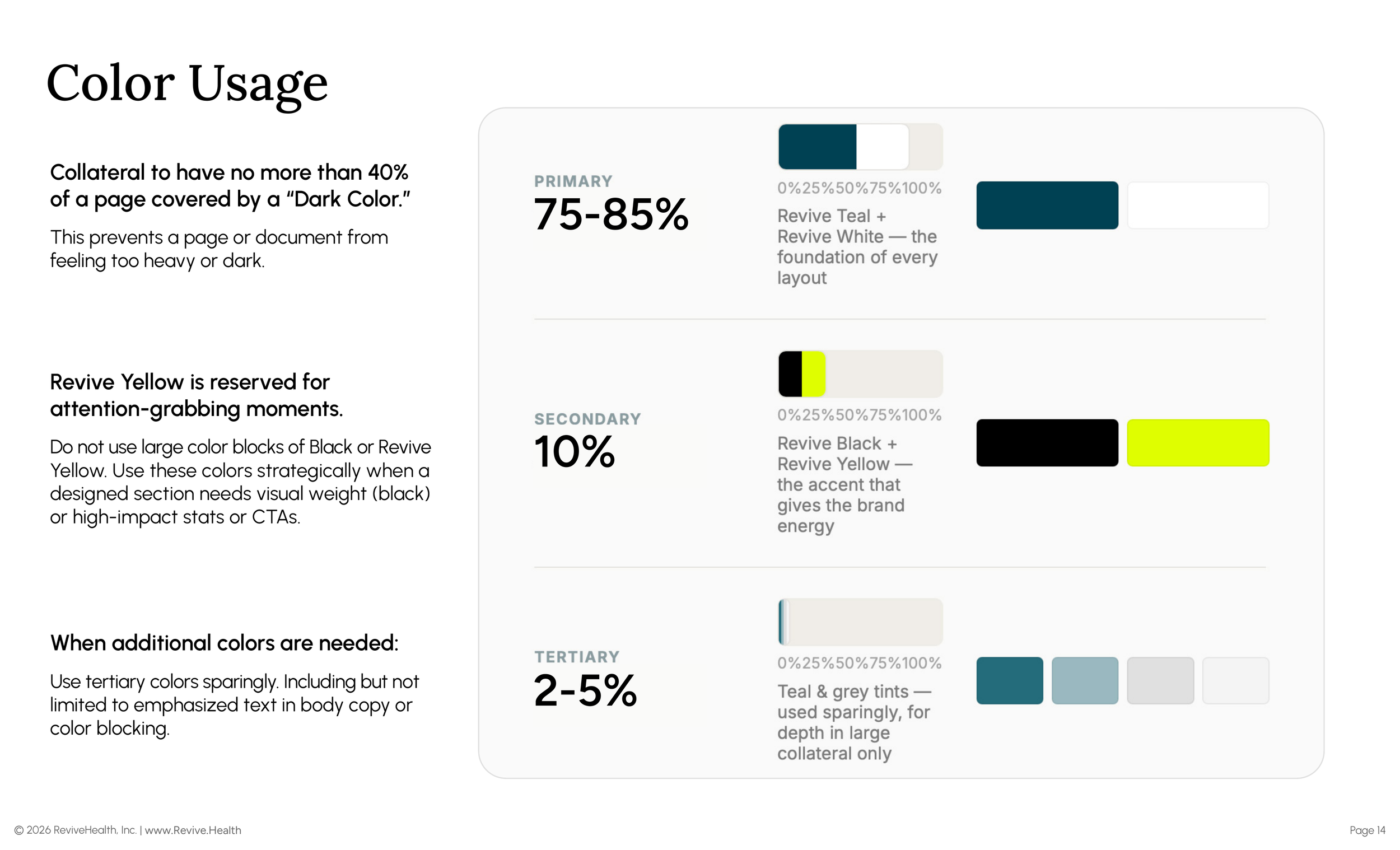
DISCIPLINED COLOR USAGE : No more than 40% of a page may be covered by a dark color, which keeps any layout from feeling heavy. Yellow is capped at roughly 10% and reserved for attention-grabbing moments — never large color blocks.
THE RESEARCH BEHIND IT — This is where the color research phase pays off most visibly. Five-cohort testing found that a yellow-only palette scored as low as 5.4/10 with users 60+, driven by two specific, measurable problems: yellow reads as a warning signal to older users, and yellow-on-white fails WCAG AA outright (1.07:1, “completely illegible”).
An Amber accent color was tested as one possible fix and lifted every cohort to 7.8+; a refined yellow value (#FFE000 vs. #DFFF00) was tested as a second possible fix. The finalized system took a third path: it kept the original Revive Yellow, but replaced ad-hoc usage with hard governance — the 10% cap, the 40% dark-background ceiling, and a WCAG-scored approved/non-approved combination table that makes yellow-on-white a documented, non-negotiable violation rather than a judgment call.
The research didn't just produce a color choice; it produced the enforcement rule that makes the existing brand accessible without changing it.
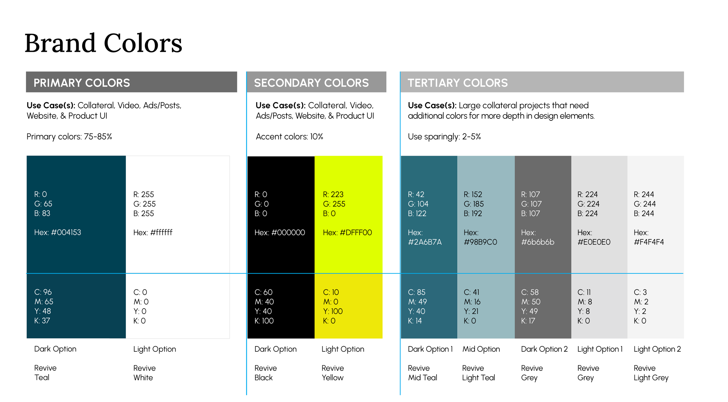
The finalized palette keeps Revive Teal, White, Black, and Yellow as the core system, with a tertiary grey/teal-tint family reserved for large collateral that needs more depth.
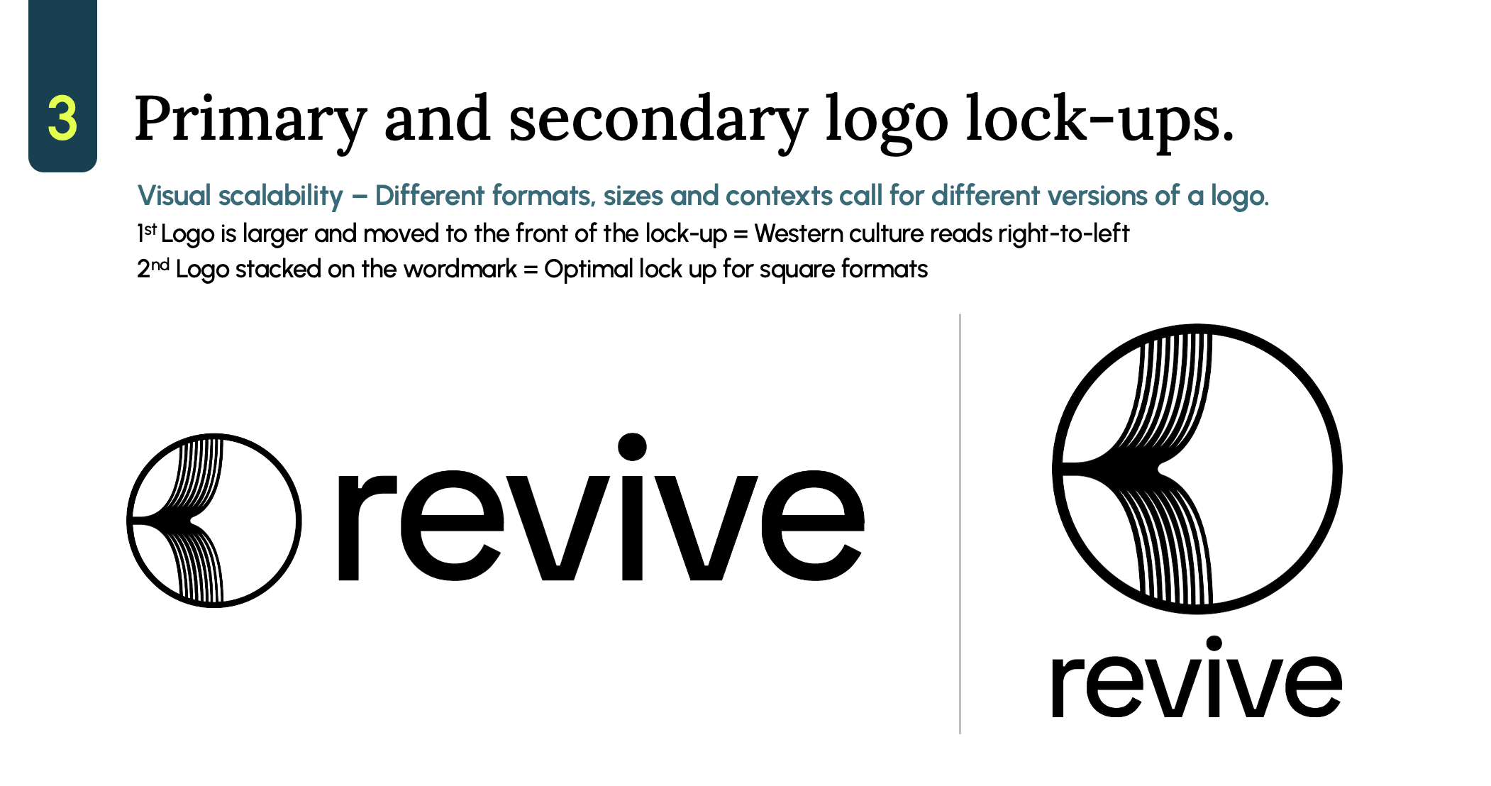
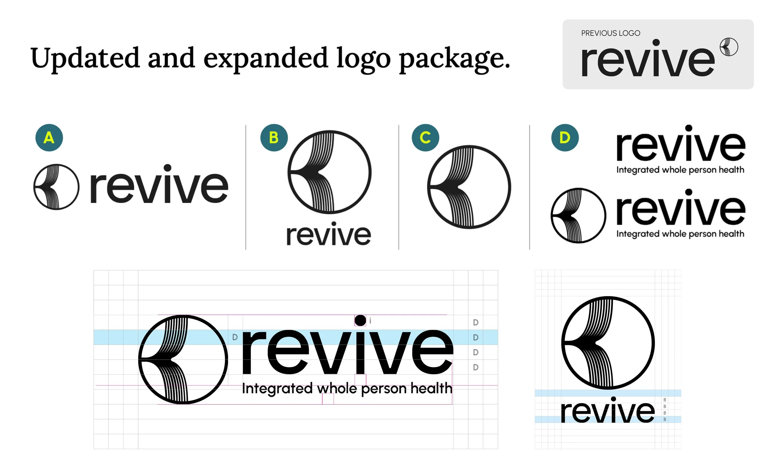
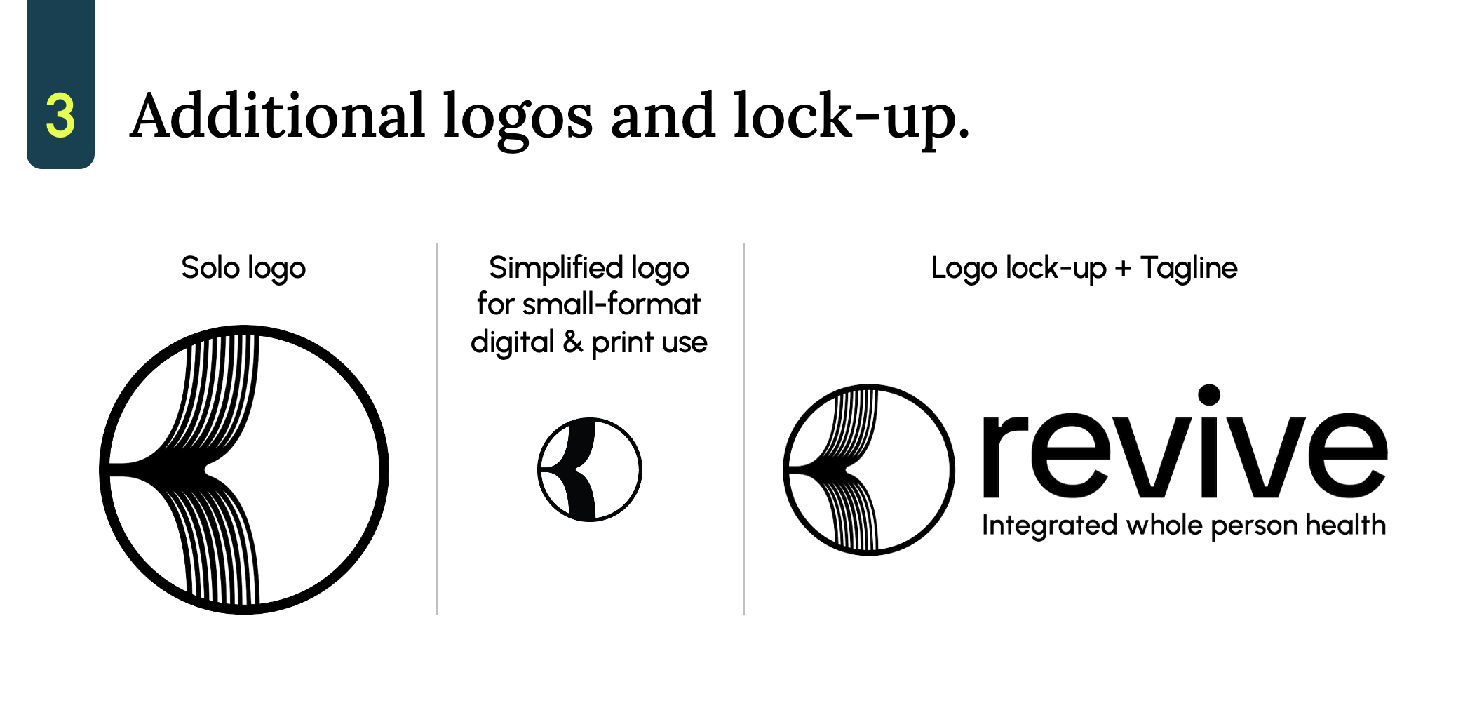
A single lockup can't serve a favicon and a trade show banner with equal integrity. The finalized kit formalizes four governed variants, each with an exact use case and a mathematically defined clear-space rule — not “use your judgment.”
Each variant has its own measurement unit, derived from the wordmark itself — using the heavy dot on the lowercase “i” as the optical reference point, since the wordmark has no ascenders or capitals to anchor against.

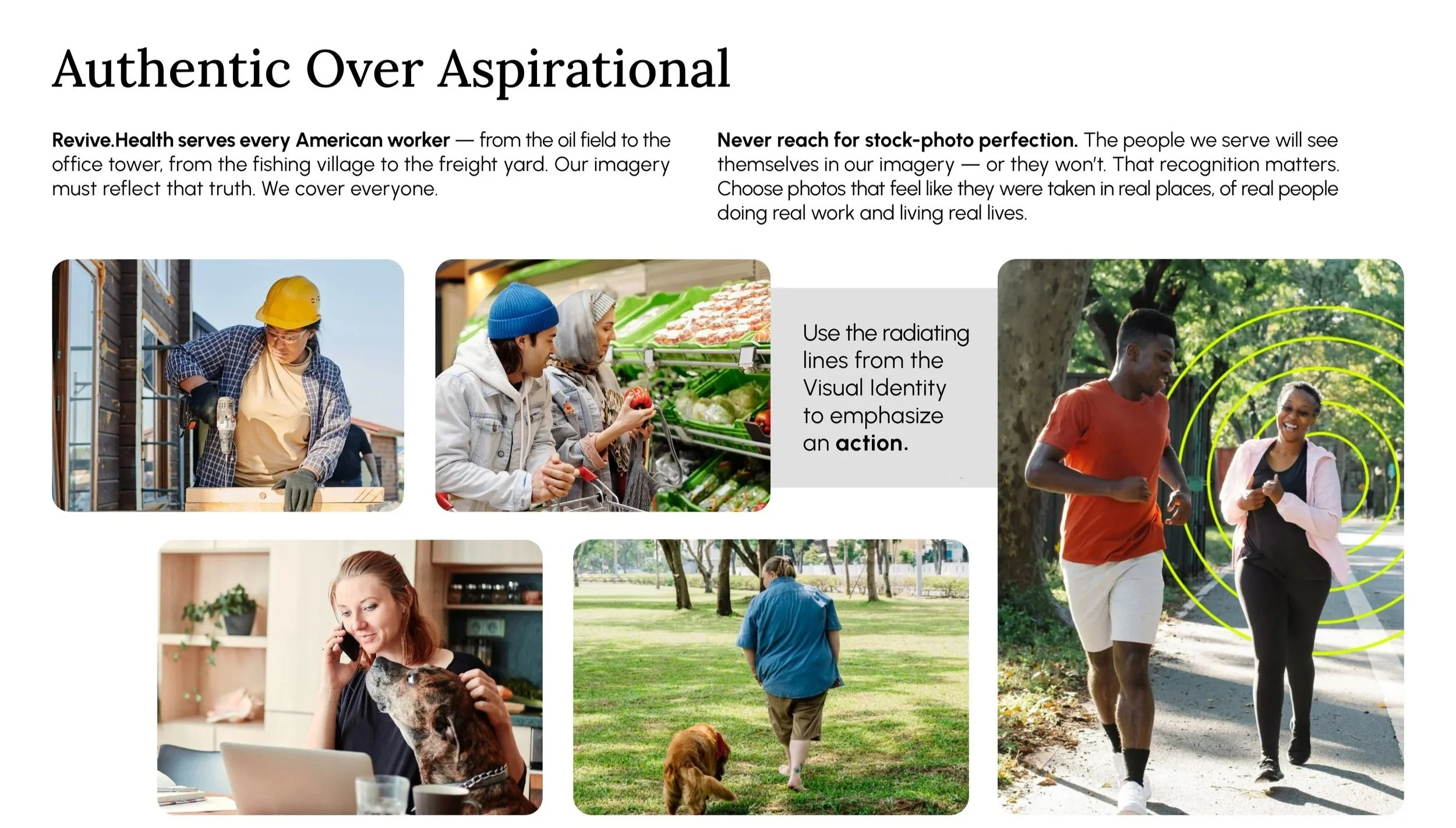
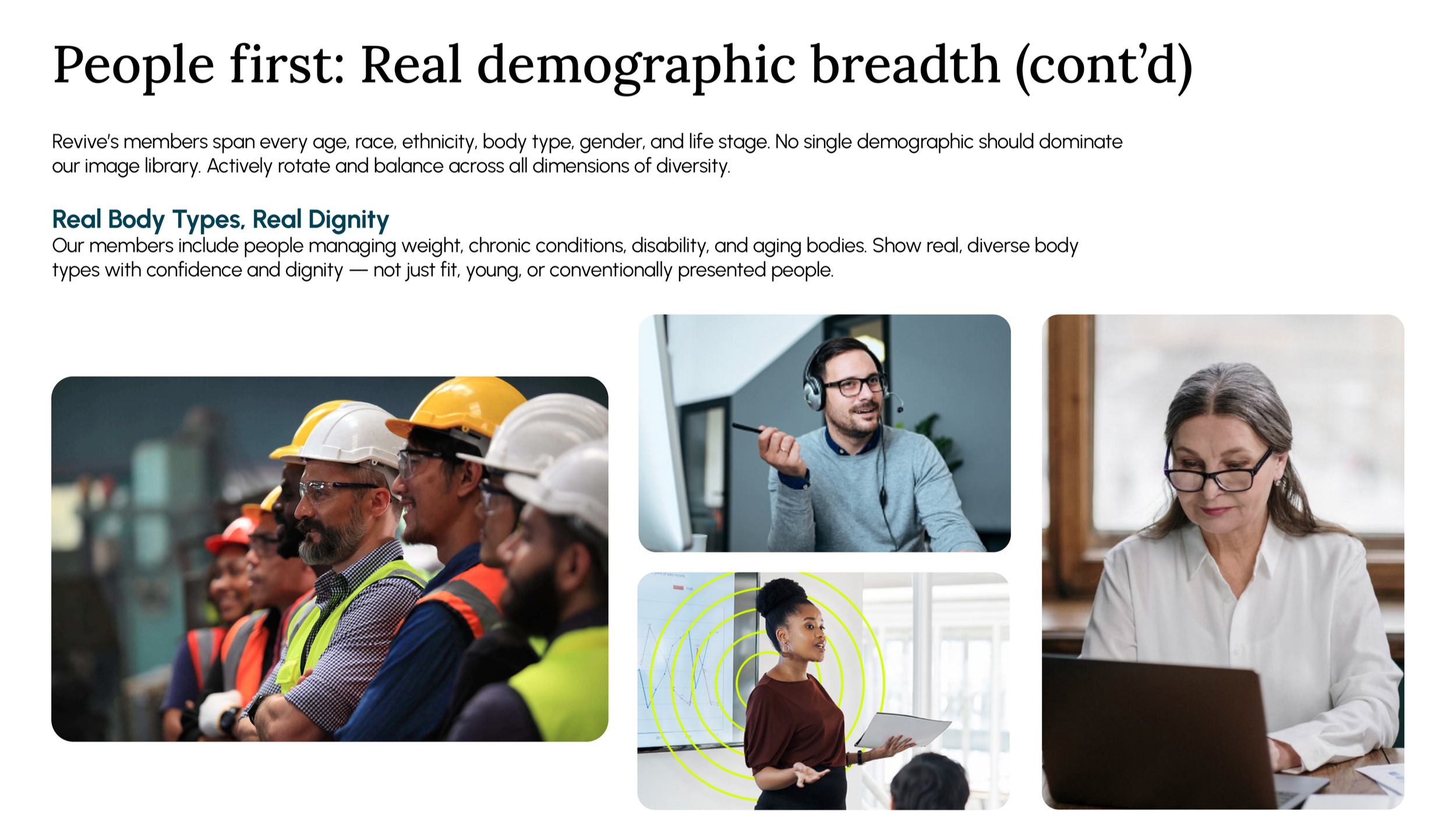
This is the most extensively developed section of the finalized guide — and the one most directly tied to Revive's actual member base. The governing principle: authentic over aspirational.